
It’s no secret that having a powerful, effective book cover is essential when it comes to getting any book the attention it needs in order to sell. The old adage – don’t judge a book by its cover – just isn’t true. We all do it, to some extent. Or if you don’t, then kudos to you. Extra brownie points.
I began my book cover journey about eighteen months ago. As with most aspects of self-publishing, the general consensus was that in order to succeed, I would need to work with a professional cover designer with a winning portfolio to create something that could stand up to the competition. It just makes sense.
But alas, my budget was tight. Food is more important than book components, as much as we sometimes wish it wasn’t true. And this is my first book venture. A steep learning curve. So what if it didn’t succeed. I would just do better the next time!
I started with Fiverr.
Fiverr
What an absolute minefield this website is! It’s a great concept in theory. New talents looking to find an avenue to showcase their ability while at the same time not charging an arm and a leg. Writers, marketers, influencers and such looking for engaging content and designs at very affordable prices.
I whittled it down to three designers who seemed to have a solid back catalogue of work. Turns out that most projects do end up costing more than a fiver, but it’s still a far cheaper option than using more established creators. I gave each of them this description of what I wanted for the cover:
“Essentially the key aspect for the front cover is the silhouette of a girl with a thunder/lightning scene contained within her. I would like a subtle yellow glow surrounding her. The base colour should be white, but I would like there to be a dark purple/yellow swirls/wisps for the patterning. Darker purples rather than violet.
A possible addition that I would like to experiment with – in her right hand, I would like some form of coalescence of yellow light swirling. In her left, something similar, but with pale blues. I’m not sure how well this would work with the fixed outline. I’ve attached the original character concept art to try and demonstrate what I mean.
For the font I’m leaning towards something along the lines of the Sarah J Maas I’ve attached, and most likely silver. I would like there to be a slight difference in colour for the author name/subtitle and the book title. Please capitalise the author name, subtitle and ‘Light’ from the title. I would like the author name to stretch across the top of the page.
For the spine, I would like the author name and book title, as well the image of yellow gemstone. I haven’t decided on the positioning yet and will leave that up to yourself.
For the back, similar colour scheme/pattern as throughout. I’ve attached an image for the description, though please make ‘The quins of Sarcaren have awoken. . .’ the dominant/emboldened line rather than ‘I am good.’”
If you happen to be aware of what the cover ended up looking like, then it’s immediately clear that my initial vision changed substantially as the process went on. This was an important lesson – while I did have my heart set on something, ideas develop and change over time. I needed to accept and embrace this.
Ahem. So, here’s what came back. . .
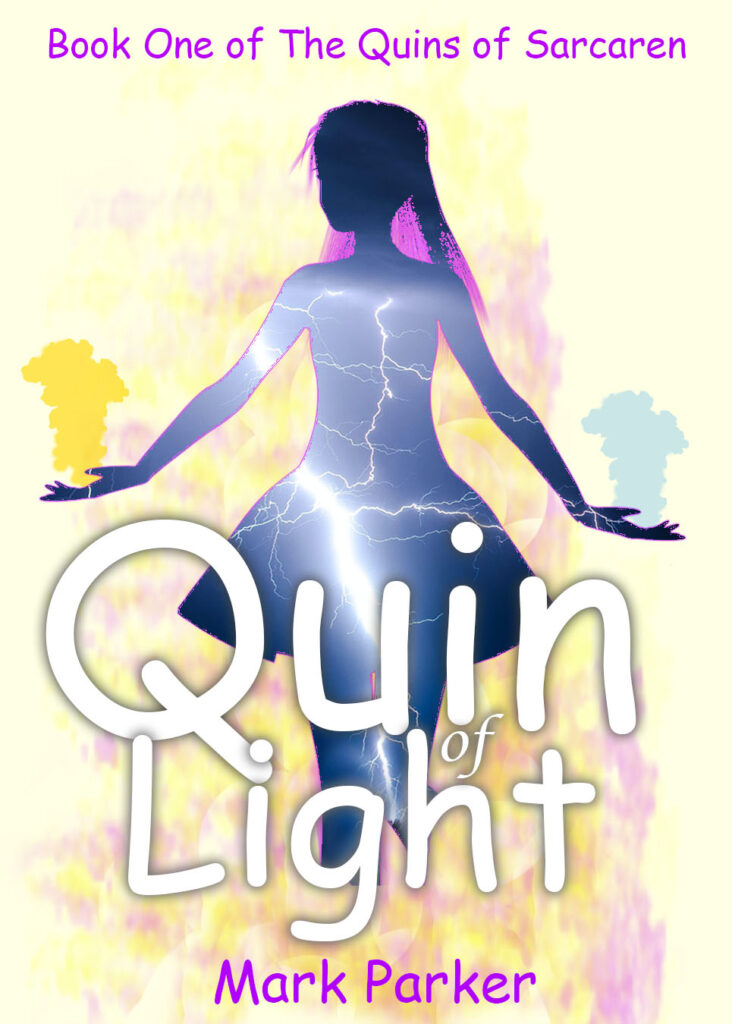
Needless to say, very little of what I suggested in the requirements came to fruition. I was disappointed and a little disheartened, with the dawning realisation that to get what I want, I would need to delve deeper into my pockets.
The Professionals and. . . An Alternative Solution
I got to work perusing through the finer details of my book collection, looking out for details of the designers/illustrators in the acknowledgements or occasionally on the copyright pages (or in the case of N.K. Jemisin and ‘The Broken Earth’ Trilogy, right there on the back! Which is kind of neat).
Once I had the names, I searched for them on Twitter. Followed a few. Checked out their websites. Winced a little. Took a deep breath and readied myself for the investment. If you want the best quality, you simply have to pay for it.
But I’ve always been very curious, and there was a nagging voice in the back of my head telling me that I should just do it myself. To hell with all the advice. I’ve dabbled with PhotoShop and I already know exactly what I want, so who better to deliver than myself?
I spent about four weeks consuming every tutorial on YouTube that I could find. I was set on Auri being on the front, and so the theme of thunder and lightning was set in stone (I lost count of how many rain overlay walkthroughs I watched).
By the time the four weeks had elapsed, I was armed with a selection of suitable images, overlays, step-by-step processes and video tutorials, all with the ultimate goal of creating my own cover. I was ready. I will try to detail exactly what I did in the next blog post (because I’m a bit of a rascal).
Thank you for giving this blog post a read. ‘Quin of Light’ my debut novel, is available for pre-order here and will be available on Kindle and paperback. You can find me on Twitter and Goodreads (complete with authentic sexy author profile now) so drop me a message and let’s chat.
And if you took something useful from this post, you might be interested in checking out my post exploring Twitter and my relationship with social media.
Peace!
HELLO.
THE NEW COVER LOOKS SOMEWHAT LIKE IT SAYS “QUIN OF TIGHT”
LOOKING FORWARD TO PART 2 OF THIS BLOG.